 |
| Venezuela. Urban Art (aka graffiti) |
Some more highlights from the
Venice Biennale - so much contemporary art, so little blog space...an eclectic selection of things that caught my eye at the Giardini site.
What I love about contemporary art: ideas made concrete; solidity; provocation; well-made things; thought-provoking; monumentality; connection with contemporary culture.
What I dislike about contemporary art: shoddily made things; penis fixations (particularly of the large and bloated kind); violence (go to the movies if you want this); video installations. And if you're going to do the "found objects" thing, you better be good, very good.
Themes I noticed in the Venice Biennale: destruction/deconstruction; digital/video anything; miniatures; collections of myriads of things - found objects, multiples works or sketches clumped together.
And -
the "hard to find entrance". The Danish pavilion had eschewed its usual front door and taped rough little paper signs pointing the way to "Entry" along the back wall and around a few corners, and you entered via a broken bit of wall. You exited through a cluttered storeroom. The Finnish Pavilion's entrance was behind a flap of black canvas. And even finding the entrance to the USA Pavilion was a bit of a challenge.When I mentioned to the door attendant that they needed a sign, she replied "I know. Unfortunately, that's the point."
Ah, contemporary art. Ideas made solid. Though not always prettily.
 |
| The USA Pavilion. |
 |
| The Swiss Pavilion. |
 |
| Entrance this way. |
 |
| The UK Pavilion. Something about Prince Harry probably shooting an endangered species. |
 |
| The Australian Pavilion. I don't know. But I liked it. |
 |
| The Uruguay Pavilion. |
 |
The Hungarian Pavilion. Started strong with a theme about unexploded shells, but lost me when it
devolved into a video-and-earphones thing. |
 |
| A very good performance piece going on in the Central Pavilion. There was chanting. |
 |
Swiss artist Jean-Frédéric Schnyder. I think this is the devil. In a Tyrolean hat.
Central Pavilion, Giardini. |
 |
| Brazilian Pavilion. |
 |
| Brazilian Pavilion. It's called "Soft Books". |
 |
This was a sound exhibit. Unfortunately the local authorities had insisted on
reduced decibels and limited "sounding" times. About which the artiist was miffed. |
 |
| This was the Romanian Pavilion. There was nothing in it. |
 |
| The Venice Pavilion (the city has its own). A 'Silk Map' theme. This is inside a large silk egg. Really. |
 |
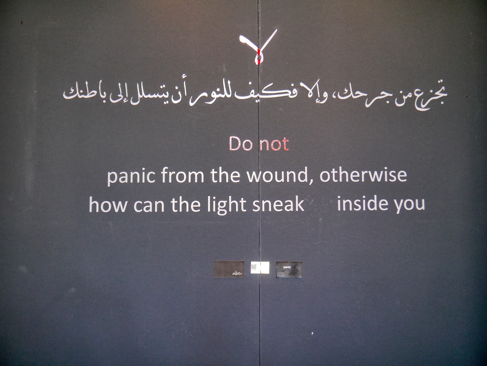
| Egypt. Yup. |
 |
| Egypt. Beautiful and golden. |
 |
Serbia. Vladimir Perić. "3D Wallpaper of Children's Room" (2007)
Composed of Mickey Mouse figures collected personally by the artist from flea markets.
(You should see his razor-blade bathroom wallpaper). |


No comments:
Post a Comment